|
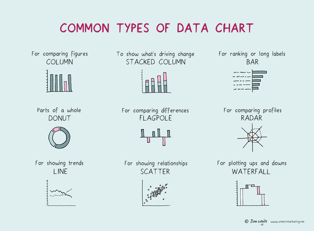
How data is represented visually has a big impact on how well they are understood and remembered. Tables of numbers leave most people cold but showing the same numbers via a well chosen chart can bring their meaning to life. This graphic illustrates nine of the most useful types of data chart and when each is most relevant. What to learn more? Try asking Virtual Dan White. |
- Home
- Books
-
Illustrations
- Marketing
- Brand Development
- Brand Experience
- Innovation
- Communications Strategy
- Media Characteristics
- Creative Content
- Pricing & Sales Promotion
- Measurement
- Data and Analysis
- Brand Review & Planning
- Brand Extension
- Mental Processes
- Business
- Business Story Telling
- Case Examples
- Wellbeing
- People Skills
- Life Hacks
- Articles
- Media
- Services
- Merchandise
- Contact
