Trying to create a distinctive brand asset by owning a particular visual style is a tall order. To succeed, the visual style must be truly unique, and the brand must use it consistently across channels and over time.
Here are some examples of brands that have built a strong association with a particular look: Tiffany - monochrome apart from its iconic Tiffany Blue colour (Pantone 1837). Google -–the three primary colours + green on a white background. Guinness - mainly dark hues with cream and a hint of gold, reflecting the drink and its logo. Tim Burton movies - the gothic style and doll-like figures with large eyes. The problem with using a visual style as a distinctive brand asset is that the style could be copied. Calvin Klein’s photographic style has been replicated by many other brands. The photographer responsible some of the brand’s iconic advertising in the 1980s, Bruce Weber, has since worked with Ralph Lauren, Abercrombie & Fitch, and Versace. A better bet in the long term is to combine a unique visual style with something owned by your brand. Absolut Vodka, LEGO, and Red Bull feature their products; Target highlights its logo. Apple’s famous iPod advertising featured their iconic earbuds. 
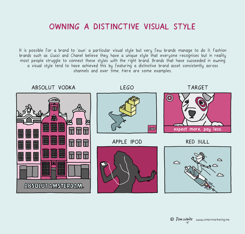
For a discussion about this topic, check out this LinkedIn thread. What to learn more? Try asking Virtual Dan White. |