|
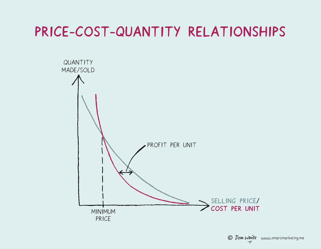
This graph shows two things. The green line shows how the quantity of a product sold typically goes down as its selling price increases. The red line shows how the cost to deliver the product typically goes down as you sell more. To understand this, start at the bottom right-hand side of the red line. It costs a lot per unit if you sell a low quantity but the cost comes down dramatically if you make and sell a large quantity. If you can estimate these curves, you will be able to identify the minimum selling price required to deliver a profit and the optimum price point, which is the price at which you would achieve maximum profit per unit sold. What to learn more? Try asking Virtual Dan White. |
- Home
- Books
-
Illustrations
- Marketing
- Brand Development
- Brand Experience
- Innovation
- Communications Strategy
- Media Characteristics
- Creative Content
- Pricing & Sales Promotion
- Measurement
- Data and Analysis
- Brand Review & Planning
- Brand Extension
- Mental Processes
- Business
- Business Story Telling
- Case Examples
- Wellbeing
- People Skills
- Life Hacks
- Articles
- Media
- Services
- Merchandise
- Contact
